Form Builder 
Introduction 
Form Builder is an Easy Forms key piece. It's where forms are created and updated. The form builder provides the necessary tools for add and remove fields as other HTML elements.
User Interface 
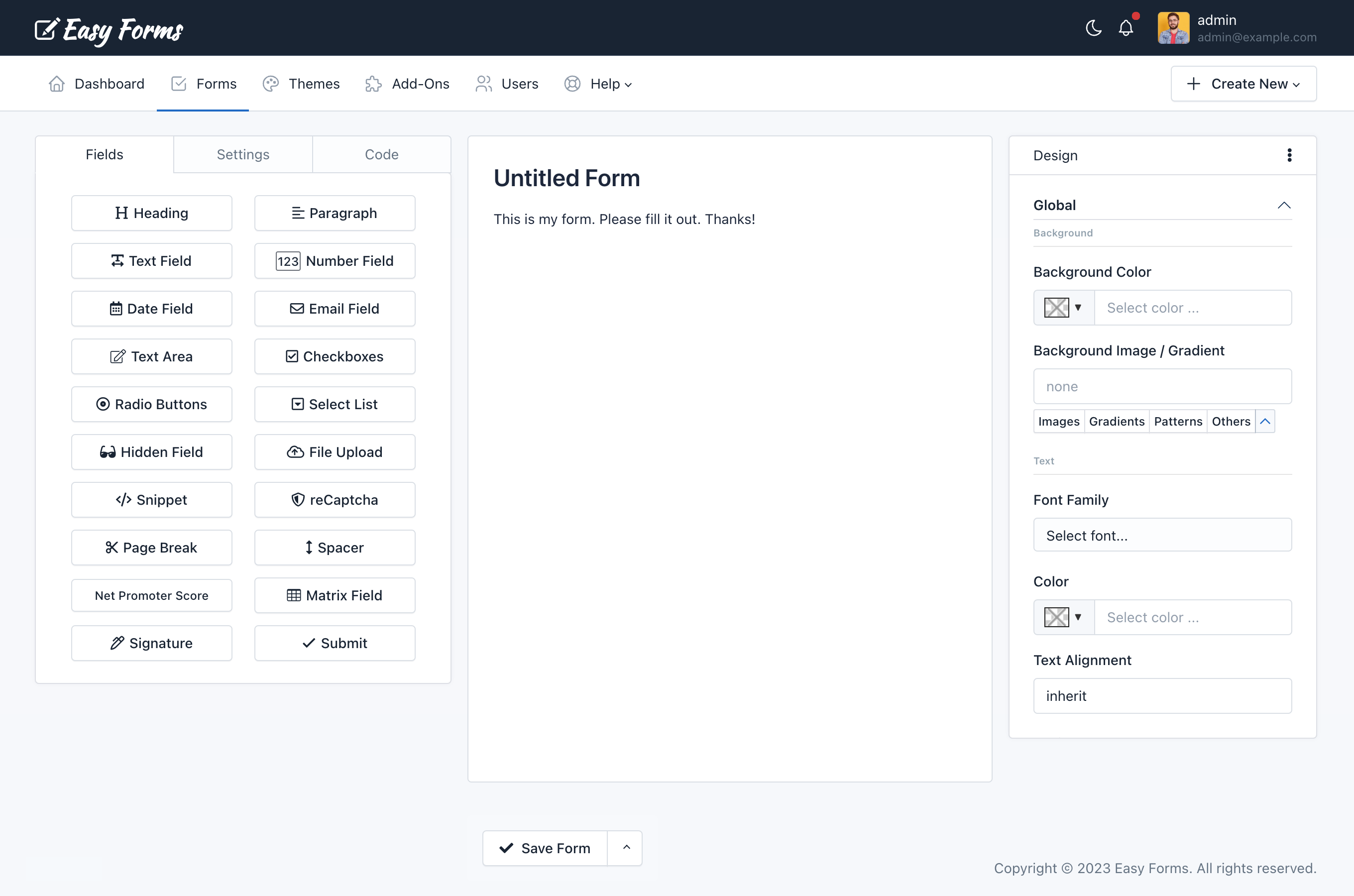
The Form Builder interface is divided into three areas: On the left the form fields, on the right the theme designer and in the center the form preview.
The left panel has three tabs:
- The Fields tab displays all fields and elements that can be added to the form. Simply drag and drop them to the right area.
- The Settings tab lets set the form name, the form layout (labels position) and disabling all fields.
- The Code tab lets see in real time the HTML code that is being generated with the Form Builder. From here you can recognize each element ID to manipulate the Form in a more advanced way. A "Copy" button allows you to copy the entire source code easily.
The center area is the Form Preview from where you can manipulate each of the components.
The right panel is the Theme Designer from where you can customize the look and feel of your form:
- Backgrounds: Change the background of different elements on your form.
- Typography: Choose the font, style, size, and color of all the text elements on your form.
- Borders: Set the thickness, style, and color of the borders around certain elements on your form.
- Shadows: Add or remove a drop shadow around your form.
- Buttons: Change the text of the Submit button.
- And much more!
- Add a field 
There are two ways to add a field:
- Clicking a widget on the left panel. That's all! The form component will appear in your form, below all other components.
- Or, if you want to add a field in a specific placement.
- Click a widget on the left panel and Drag it to the right area.
- At the time you enter the Form Builder's active area, a box will indicate where will be placed the Field.
- Once you placed it where you need, drop the button.
- Edit a field 
To edit a field:
- Click on the field to edit, and a pop-over will appear with field information
- Edit the information according to your requirements.
- Click Save.
Note: Pressing ESC will close the popovers.
- Reorder the fields 
To reorder a field (component):
- Click on a component and hold
- Drag the component up or down according to your requirements.
- According to where you drag the component, an active zone where the component will be placed will appear.
- Once placed in the required place, release the component.
- Drag fields to create columns 
To create columns with a field (component):
- Click a widget on the left panel and Drag it to the form builder canvas.
- Drag it to the left or right of an existing field.
- A border will indicate where will be placed the field.
- Once you placed it where you need, drop the widget.
Within the form builder, you can drag existing fields into the "column drop zone" - the builder will then automatically resize all fields within the drop zone to create columns of equal width.
You can create until four columns with this method. However, you can design forms with/until 12 columns that fit perfectly with the space available on your website by using the Container Css Class feature.
- Copy a field 
To copy a field (component):
- Click on a component and hold.
- Click the 'Copy' button in the Popover window
You'll notice that the copied field will appear below the original field.
- Delete a field 
To delete a field (component):
- Click on a component and hold.
- Drag it out of the active zone.
- Release.
You'll notice that the component has disappeared.
- Copy Field ID 
To copy the Field ID follow these steps:
- Click on a component and hold.
- Click the 3 vertical dots (in the Popover heading)
- Click Copy ID.
Now you can paste it in other place like a custom email message or a CSS design.
Basic Form Settings 
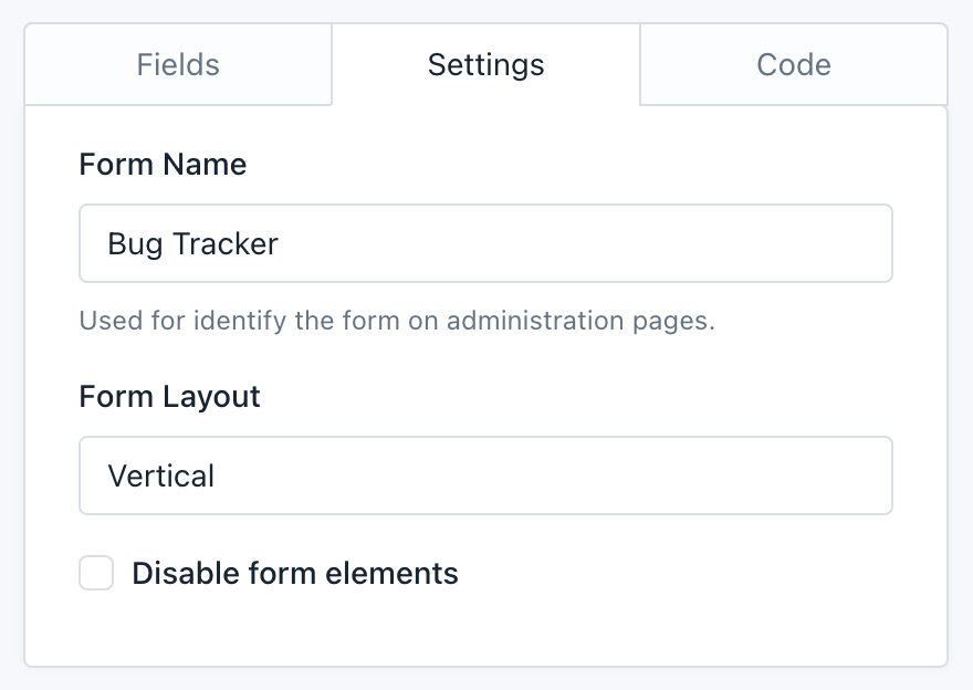
By clicking on the Form Builder's Settings tab, you will access a very basic version of the form configuration. From here you can:
- Change the form name: The form name is to recognize the Form in the administration pages and is also display as the Form public page title at Easy Forms.
- Change the form layout: The form layout is based on Bootstrap CSS and is used to locate the labels position on the form.
- The Vertical layout displays the field labels above,
- The Horizontal layout displays the labels on the field left side, and
- The Inline layout hides the labels and displays the fields next to each other. For example, you can use it on a mail registration form, to place an Email field and a button by the side.
- Disable form elements: Let you disable all form fields. It is an advanced option that can be useful if you plan to interact with the form from an external javascript file.
These basic options are intimately related to the form builder. However, you have other Setup options much more advanced that can be accessed from the Form Manager.
Field Settings 
Each form field has many Setup options, for example, the label, the default value, the CSS class, etc. To set up a field, go to the preview and click on it.
Setup Options 
Next, all the Setup Options are shown in alphabetical order. Not all are in all fields, but if you have any problem, use this list as a reference.
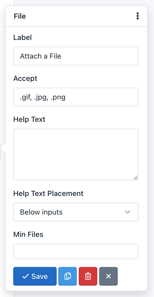
- Accept: 
This option is in the File Upload field. With it you can limit the type of files the field can accept. You should consider the following
- You must add the file extensions starting from the dot and separated by commas.
- By default, all files will be validated and will only be accepted image files with extension '.gif, .jpg, .png'.
- For example, to accept text files, you can change this option to: '.doc, .docx, .txt'.
- If you want to accept all types of files, you must leave this blank.
- This option enables the 'accept' attribute from the HTML5 standard, so the field validation is performed both on the client side (browser) and server side.
- Alias: 
The Alias option let you send WebHook notifications using the Field Alias instead of the Field Name. For example, we'll be able to re-send POST data by using “name” or "age" instead of “text_0” or "number_0".
- As Button: 
The "As Button" option let you display Radio Button fields and Checkbox fields as Buttons.
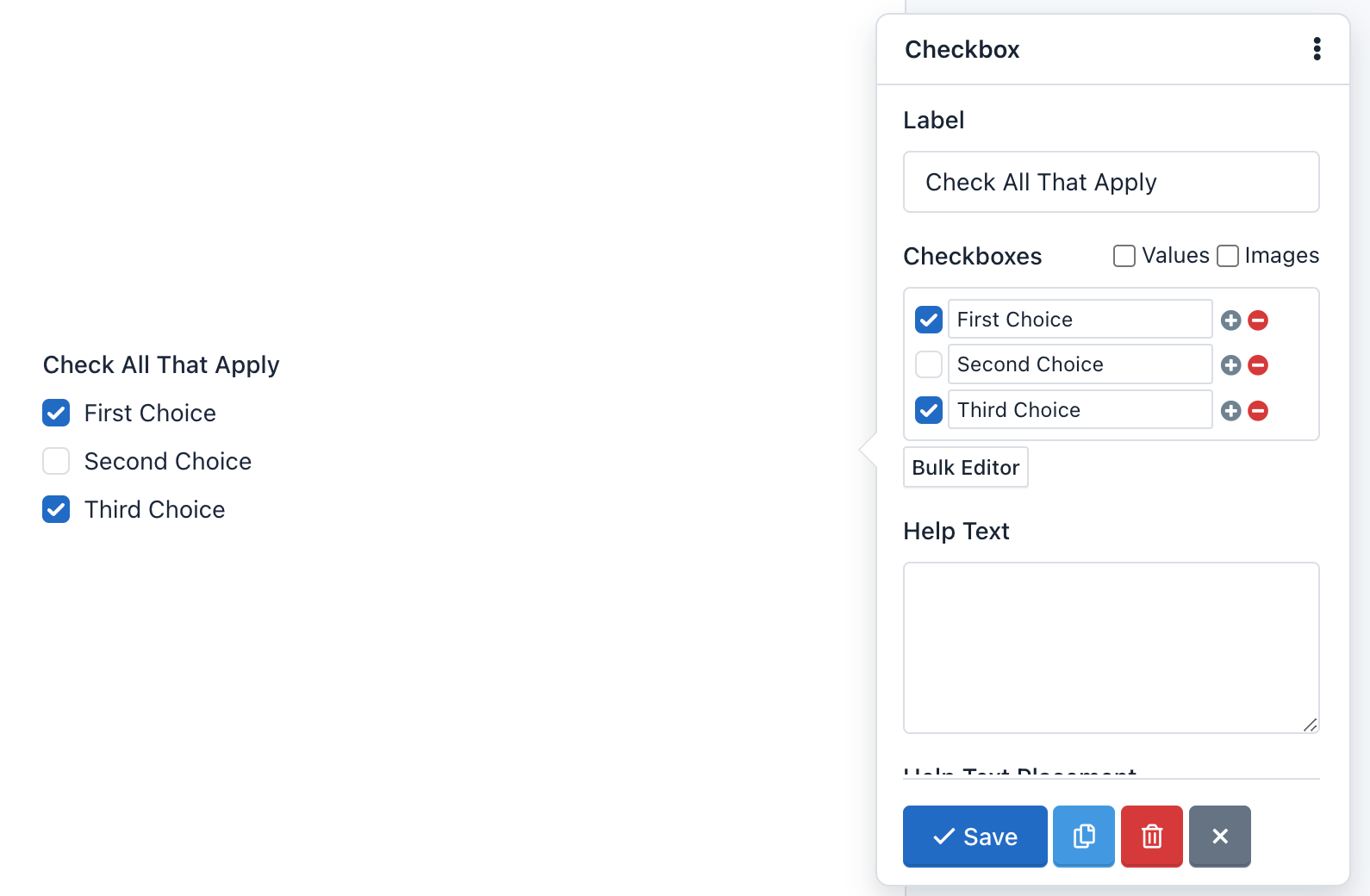
- Checkboxes: 
The Checkboxes option is only available in Checkbox fields, and it's used to add checkboxes to the component.
For example, enter the Bulk editor and add the following "Checkboxes" and click "Save":
First Choice|1
Second Choice|2|selected
Third Choice|3
Fourth Choice|4|selected
Fifth Choice|5
The form preview will show a Checkbox component with 5 checkboxes: First Choice, Second Choice, Third Choice, Fourth Choice and Fifth Choice. The "Second Choice" and "Fourth Choice" checkboxes will be checked. And finally, if the user submits the form without making any changes, he will be sending the values: 2,4.
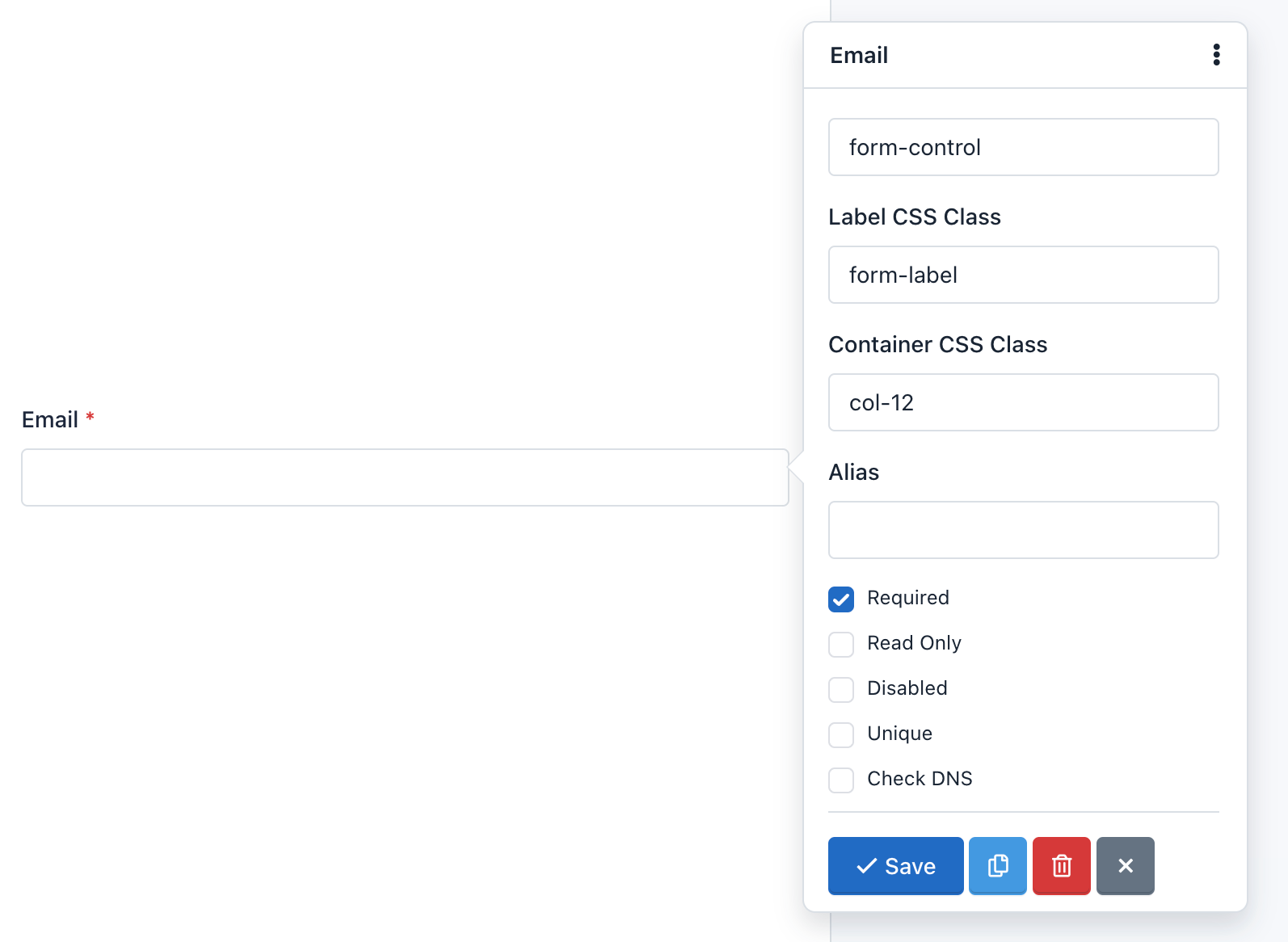
- Check DNS: 
This option tells the application that in the process of Email Field validation verify that the email domain really exists and has 'A' and 'MX' records.
Caution! This is an advanced option and should be used with caution. Verification may fail due to a problem with the DNS servers even when is a valid email. By default, it is disabled.
- CSS Class: 
Let you add one or more CSS classes to the Form Field.
- Container CSS Class: 
Let you add one or more CSS classes to the container of the whole component.
You can create multi-column forms by defining the class col-xs-* (the asterisk represents the number of columns, between 1 and 12).
For example:
If you want to place two fields in two columns you must do the following:
- Add the container CSS class to the first field: `col-xs-6
- Add the container CSS class to the second field: `col-xs-6
In this example, we are using the "no-padding" predefined CSS classes to remove the padding that Bootstrap CSS adds to the columns. You can add them or not according to your design. If not, you can add the container CSS class col-xs-12 to the rest of fields, to preserve the same padding on each field.
Important! You can go to the Bootstrap CSS documentation for more information.
Note:
- By default, all fields except Button, come with the class:
form-group. This class cannot be edited.- By default, the field Button comes with the class:
form-action. This class cannot be edited.
- Custom Attributes: 
You can add custom attributes to a field. These attributes have two parts: The attribute name, and the attribute value. This feature allows you to create more accessible forms, specially because you can use it to add:
- Data attributes: Useful to integrate form fields with javascript libraries
- Aria attributes: Useful to describe form fields in a better way and offer more accessibility.
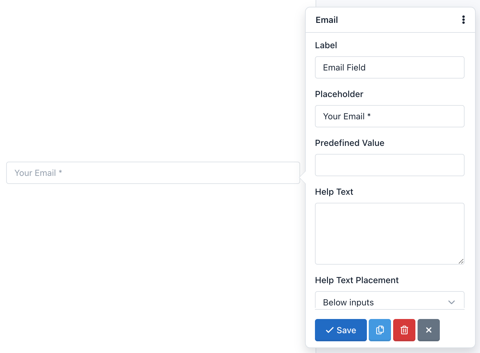
- Default Value: 
You can add a default value to a field. This value appears by default, but the user can modify. If the user submits the form without having modified the default value, this value will be collected to process the submission.
- Disabled: 
You can disable a field if you want it to be displayed to the user, but not be edited. (Note that you can also disable a hidden field). Unlike the Read Only option, a disabled field is not sent to the server. That is, the information stored in a disabled field is not received and therefore not appear on the Submissions Manager.
- Field Size: 
A Text Area field allows its size configuration. The size must be an integer and indicates the number of rows displayed or, in other words, the field height. By default is 3.
- Help Text: 
The text you type here will appear below the field and is often used to give the users instructions on what to put in it.
- Help Text Placement: 
This Drop Down menu allows you to move the Help Text above or below the form field.
- Inline: 
The Inline option is in the Checkbox fields and Radio Buttons and is used to change the vertical position of the checkboxes or radio buttons for a horizontal position.
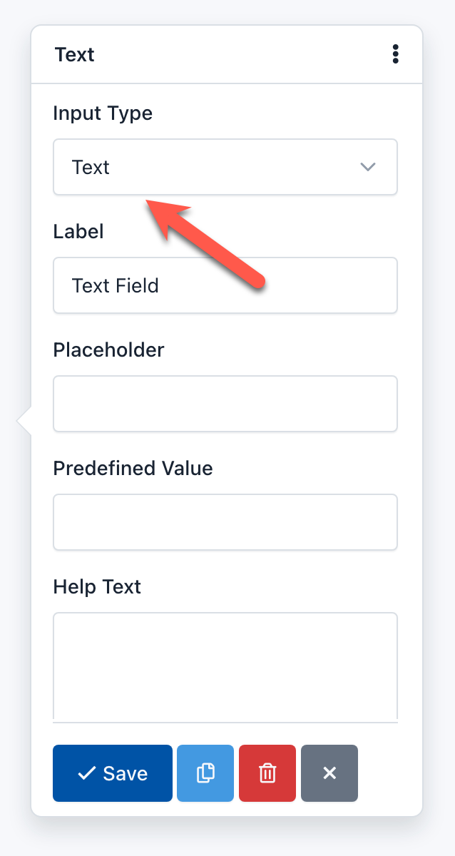
- Input Type: 
Many fields allow you to change the Input Type to specify the type of data you will receive. For example, a Text Field can have an Input Type "URL", to ensure that the text you type here is an absolute URL that starts with the letters 'http'.
- Integer Only: 
You can activate this option if you want the value of this field to be only an integer. If the user enters a floating point number, the Form would not be processed and instead a validation error appears.
- Integer Pattern: 
Is an advanced option of the Number Field that allows you to customize the regular expression that accepts only integer numbers (0-9) and will be used in the Form Validation process. The regular expression used by default is '/^\s[+-]?\d+\s$/';
- Label 
It is the most common way to inform the user the value he must enter in the field. Generally it is shown at the top of the field, but you can modify this position by changing the form layout.
- Label CSS Class: 
Let you add one or more CSS classes to the label. Keep in mind that if you want to hide a label, you can add the Bootstrap 3 css class 'sr-only'.
Note: By default all fields come with the CSS class: control-label. It is recommended not to remove it.
- Min date: 
You can define a date as the minimum date to be taken into account in the validating field process. If the user enters a earlier date, the form will not be sent and instead, a validation error will appear. If this option is not defined, this limitation will not exist.
The date must keep the following format: yyyy-mm-dd (HTML5 standard format) for static dates. Also, you can use tags to validate relative dates:
{today}: Today is the minimum date.{today:+1}: Tomorrow is the minimum date.{today:-1}: Yesterday is the minimum date.
- Max date: 
You can define a date as the maximum date to be taken into account in the validating field process. If the user enters an later date, the form will not be sent and instead, a validation error will appear. If this option is not defined, this limitation will not exist.
The date must keep the following format: yyyy-mm-dd (HTML5 standard format) for static dates. Also, you can use tags to validate relative dates:
{today}: Today is the maximum date.{today:+1}: Tomorrow is the maximum date.{today:-1}: Yesterday is the maximum date.
- Min number: 
You can define an integer or floating-point number as the minimum number to be taken into account in the validating field process. If the user enters a lower number, the form will not be sent and instead, a validation error will appear. If this option is not defined, this limitation will not exist.
- Max number: 
You can define an integer or floating-point number as the maximum number to be taken into account in the validating field process. If the user enters a larger number, the form will not be sent and instead, a validation error will appear. If this option is not defined, this limitation will not exist.
- Min Size: 
You can define an integer number as the minimum size to be taken into account in the process of validating the field. If the user uploads a file with a smaller size than the one you have defined, the form will not be sent and, instead, a validation error appears. If this option is not defined, this limitation will not exist.
The integer number represents the number of bytes allowed. For example, Min Size: 10311680 (resulting from the multiplication of 1024 x 1024 x 5), the minimum file size should be 5MB.
- Max Size: 
You can define an integer number as the maximum size that will be taken into account in the process of validating the field. If the user uploads a file with a size larger than the one you defined, the form will not be sent and instead, a validation error appears. If this option is not defined, this limitation will not exist.
The integer number represents the number of bytes allowed. For example, Max Size: 10311680 (resulting from the multiplication of 1024 x 1024 x 5), the maximum file size should be 5MB.
- Min length: 
You can define an integer number as the minimum length of the input string. If not set, it means no minimum length limit.
- Max length: 
You can define an integer number as the maximum length of the input string. If not set, it means no maximum length limit.
- Min files: 
You can define an integer number as the minimum number of files that the end user must upload to pass the validation.
- Max files: 
You can define an integer number as the maximum number of files that the end user must upload to pass the validation. Use this feature to allow multiple uploads with the same File field.
- Max length: 
You can define an integer number as the maximum number of files that the end user must upload to pass the validation.
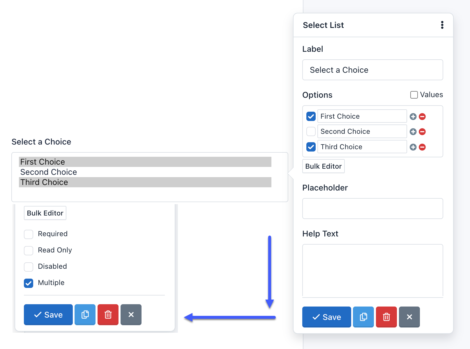
- Multiple: 
This option indicates that the user can enter multiple values. You can find this option in the Email and Select List fields:
- If Multiple option has been enabled on an Email field, you can add several valid email addresses separated by commas. For example: '[email protected],[email protected]'.
- If Multiple option has been enabled on a Select List field, you can select several options. The collected information will have a comma-separated format. For example: 'Option One, Option Two'.
- Number Pattern: 
Is an advanced option of the Number Field that allows you to customize the regular expression that accepts any number and will be used in the Form Validation process. The regular expression used by default match with a floating point number and optionally an exponent part (eg -1.23e-10): '/^\s[-+]?[0-9].?[0-9]+([eE][-+]?[0-9]+)?\s*$/'.
- Options: 
The Options option is only in the Select List fields and are used to add selection options to the component.
For example, if you enter in the Options field of the pop-up Form:
One|1
Two|2|select
Three|3
Four|4
Five|5
The Form Preview will show a box with the text "Two". And if the user submits the form without making any changes, he will be sending the value: 2.
- Pattern 
It is an advanced option and allows you to add a regular expression to the field to be used in the Form Validation process. If the value sent by the user does not match this pattern, the form will not be processed and instead a validation error appears.
- Placeholder 
It is the alternative way of describing the value that the user must enter in the field. By default, the placeholder appears in the field until the user start to enter data.
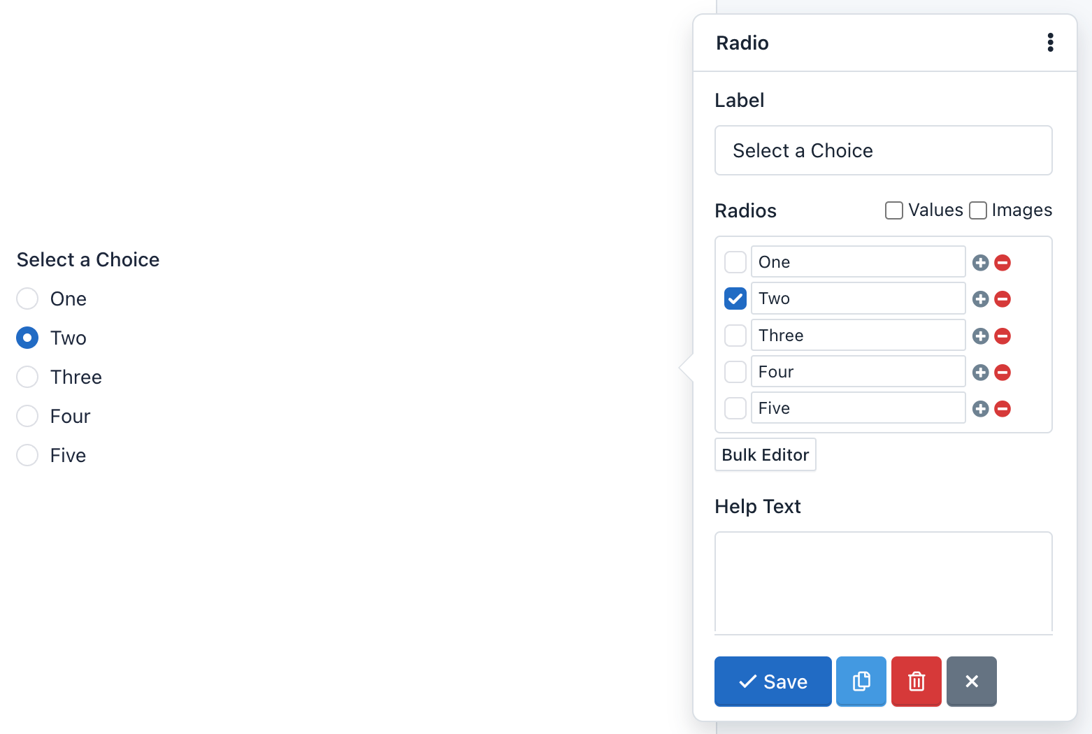
- Radios: 
The Radios option is available in Radio Button components, and it's used to add radio buttons to the form.
For example, if you click Bulk Editor and enter the following radios:
One|1
Two|2|selected
Three|3
Four|4
Five|5
The Form Preview will show five radio buttons with the words: One, Two, Three, Four and Five. The option Two will be selected. Then, if the user submits the form without making any changes, he will be sending the value: 2
- Read Only: 
When you enable this option, the field will be displayed to the user but he cannot edit. The information in a Read Only field is received and validated by the server when the Form is submitted. It will also be collected by the Submission Manager.
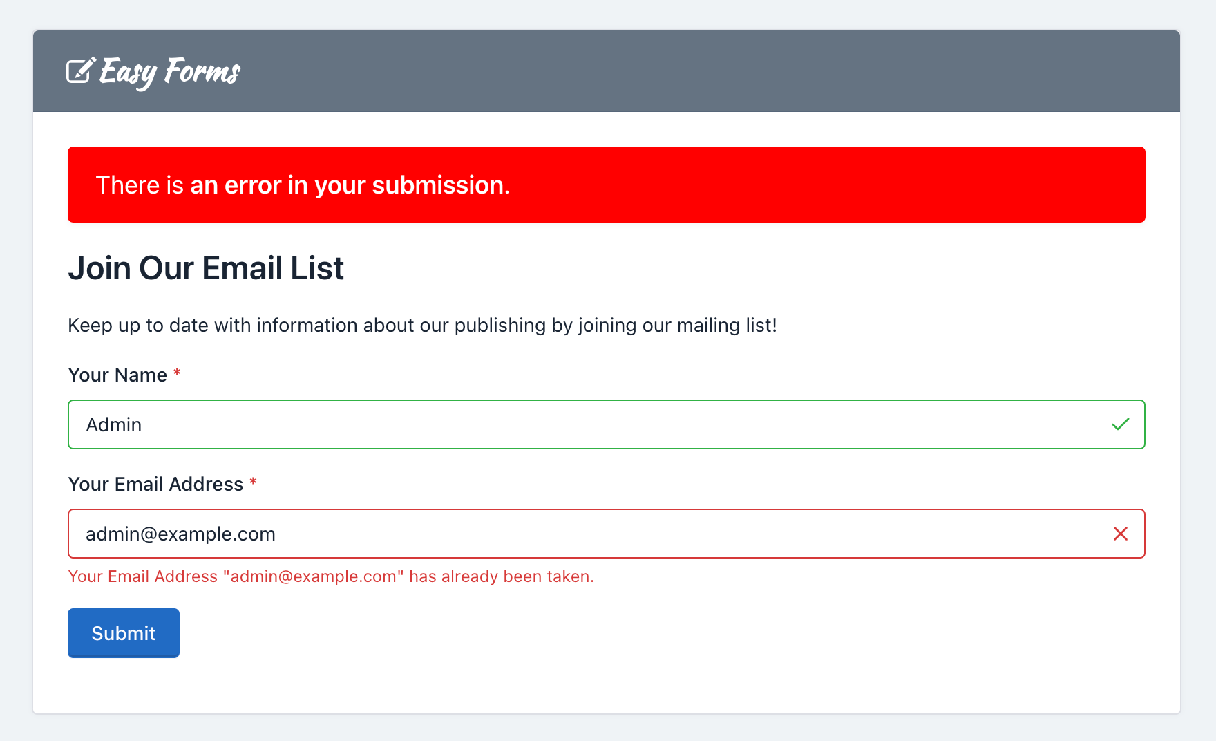
- Required 
This property allows you to ensure that the user complete a specific field before sending the form. If the user submits the form with an empty required field, the form is not processed and instead an error message is displayed. By default, the required fields labels have a red asterisk on the right.
- Step number: 
With this option, you can set the HTML5 'step' attribute of the Number and Date fields. The 'step' attribute specifies the valid number to be use as an interval when changing the values of this field using the browser controllers. Modern browsers recognize this attribute.
Important! If the Number field has the 'Integer Only' option enabled is recommended to set your 'Step number' to 1.
- Unique: 
This option allows you to check that the information entered into this field is unique and has not been submitted previously. Useful for mailing lists and registration forms, where preventing the users from entering the same information more than once is often needed.
Field Types 
- Heading 
Headings are used to mark Form sections, also as to give it a title. For example, when you enter the Form Builder to create one, you will see a heading (h3) with the text "Untitled Form". To modify this text, just click on it. Immediately a form will appear with all the options to customize it.
- Paragraph 
Paragraphs are components used for fleshing out a form. For example, you can use them to invite your users to fill out the form or to give directions. When you enter to the Forms Builder to create one, you will see a paragraph with the text "This is my form. Please fill it out. Thanks!" To modify this text, simply click on it. Immediately a form will appear with all the options to customize it.
- Text Field 
A text field is a component that allows you to write only one line of text. Web browsers consider the text field as the standard default field from others more specialized such as URL or color. The text field can have five different input types, each of which is used to validate data differently. The five types are:
- Text: This is the default type for this component. And it is one that is commonly used in forms, because it does not offer any validation and will accept all data sent by the user. If the browser does not recognize any other type, such field will be displayed instead.
- Url: This type was introduced by HTML5 and now modern browsers accept it. Use the URL type if you want to collect absolute URLs that starts with 'http'.
- Color: This type was introduced by HTML5 and modern browsers that accept it, displays an automatically color palette when you click on it. Use the Color type if you want the collected data to be the hexadecimal value of a color, starting with a '#' sign. For example, '#FFFFFF'.
- Tel: This type was introduced by HTML5 and now modern browsers accept it. Use this type if the data to collect is a phone number.
- Password: All browsers recognize this type of entry. Use this entry type if you want the user to enter data not shown on screen. Note that Easy Forms is not meant to store passwords, mainly because the data is stored as plain text. If required, use this input type with caution.
- Number Field 
A number field is a component used to collect numbers as content. Following the HTML5 standard, this component can be of 2 types:
- Number: This is the type that should be used when you want the user to type the number. For example, you may ask: "How old are you?" If the user enters 'Five years', they are notified that they must write only numbers: 5, in this case.
- Range: This type of entry is also used to collect numerical data, but unlike Number, modern browsers display a slider the user can use to enter his data. For example, you can ask "From 1 to 10, how good are you at math?" Depending on how you drag the slider, the value will be higher or lower.
Unlike Text components, Number components offer many different validation options. For example, Integer Only indicate that the field must collect only numerical integers data: Decimals are not accepted! You can also set the minimum and maximum number to be entered and more. All these options follow the HTML5 standard and are also validated on the server.
- Date Field 
A date field is a component used to collect valid dates. Date fields were introduced by HTML5 and modern browsers that recognize them display a calendar by clicking on the field. This component can have 5 different types of input:
- Date: The input type to use if you want to collect dates. You must have the format: yyyy-mm-dd.
- DateTime-Local: The input type to use if you want to collect dates and times. The collected data will have the standard ISO format: yyyy-mm-ddThh:mm:ss.
- Time: The input type to use if you want to collect times in the format: hh:mm. To collect seconds in this format: hh:mm:ss you need to set a Step of "1" second.
- Month: This type of entry is supported by modern browsers and should be used if you want the user to select the month or month and year. The input format is yyyy-mm.
- Week: This type of entry is supported by modern browsers and should be used if you want the user to select the week of the year in numerical format.
Note: Indeed some modern browsers don't yet show the Datepicker when the field is a date. But, in the future all of them will do. For now, browsers that don't support it are Safari, Firefox and previous versions of IE. For these cases, we can use a jQuery UI Datepicker widget as fallback.
- Email Field 
An email field is used to collect valid emails. By default it validates that the text contains a '@' and '.' plus two or more characters for the e-mail domain. In addition, you must use this field to send notifications that have your users mails as senders (Reply-To).
An advanced option of this field is the ability to verify the mail DNS to confirm that the domain really exists and has an A and MX record. Care should be taken that this validation can fail due to problems with the DNS servers even when mail is valid. By default, this option is disabled.
- Text Area 
A text area is a component that allows you to collect multiple lines of text, with multiples paragraphs. It is a suitable field if you want users to draft a comprehensive text. Also, you can change some settings. For example, you can change the height of the text area, to display more space to your users. To do this, click on the text area and change the size of the field that by default is 3.
- Checkbox 
The Checkbox component adds checkboxes to the form. This component provides an option list with a checkbox next, so your users can check all, some or none. You can use it if you want to get several answers, for example: Which of the followings are fruits?
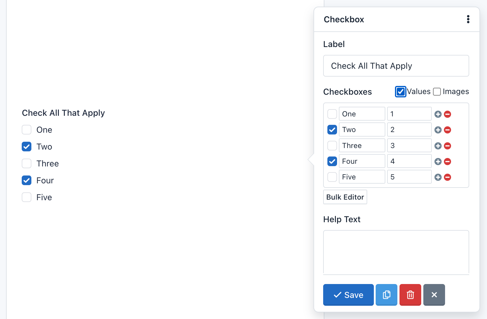
To add, edit and delete checkboxes, you must click on the component. Then a form appears with the "Checkboxes" field. Note that each line of this field represents a different choice. Each choice can be composed of three parts: Label, Value and Image. Additionally, you can check them.
Also, you can choose the Bulk Editor tool to insert choices separated by a vertical bar or pipe line. The format should be as follows: Label|Value|selected. The second and third part of this format is optional.
For example, click Bulk Editor and add the following "Checkboxes":
One|1
Two|2|selected
Three|3
Four|4|selected
Five|5
The Form Preview will show 5 checkboxes with the words One, Two, Three, Four and Five. The "Two" and "Four" option will be selected. And, if the user submits the form without making any changes, it will be sending the values: 2,4.
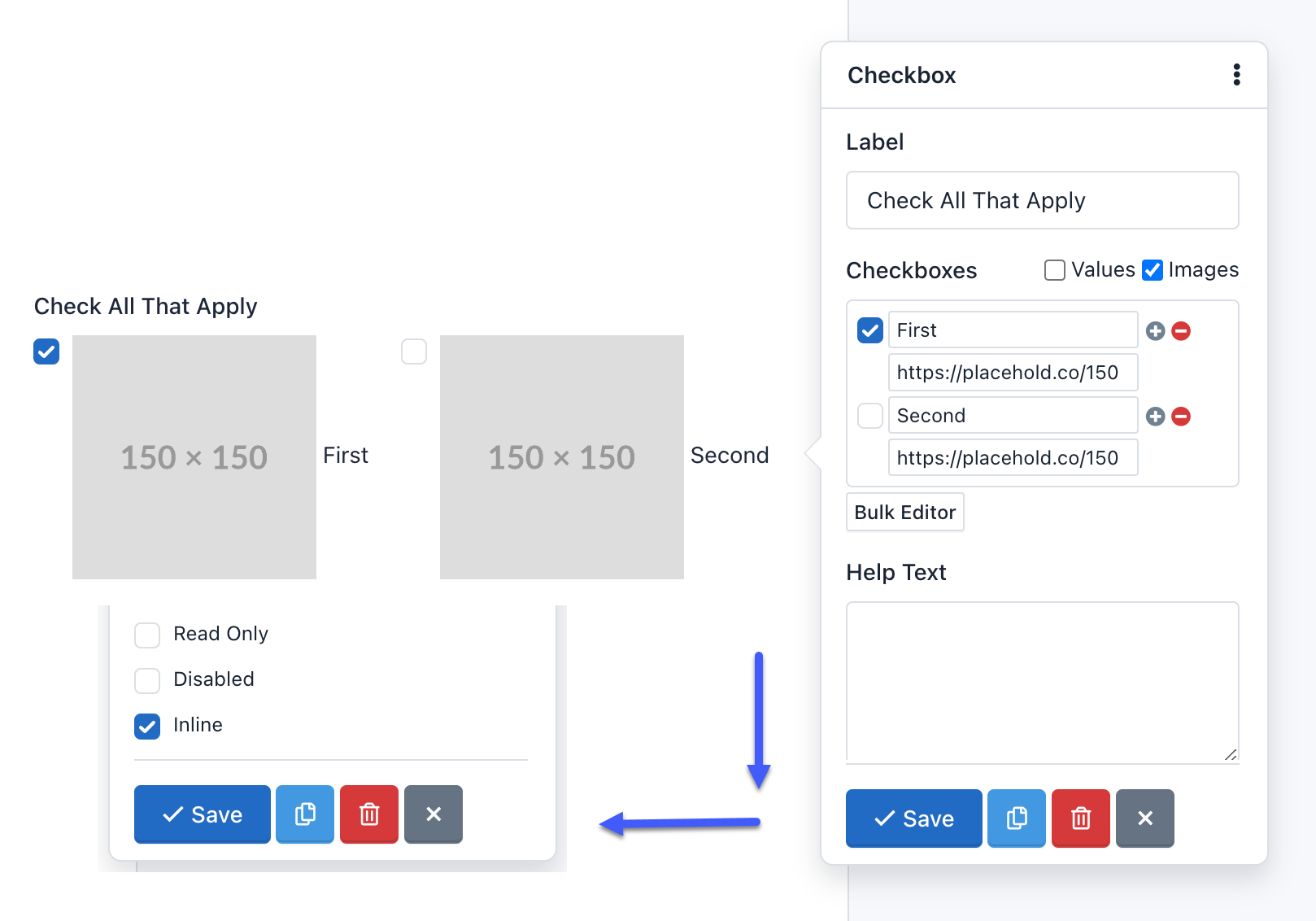
Also, you can add pictures or icons to the checkboxes to give a more dynamic touch to your forms.
To insert a picture on a checkbox label you must add the image url as the third setting parameter of the checkbox. For example, if we set up our component as:
One
Two|2
Three|3|selected
Four|4|http://example.com/image-4.jpg
Five|5|http://example.com/image-5.jpg|selected
We'll be creating five checkboxes:
One: Creates a checkbox with the value: 'One' and the label: 'One'Two|2: Creates a checkbox with the value: '2' and the label: 'Two'Three|3|selected: Creates a checkbox with the value: '3', the label: 'Three' and will be checked by default.Four|4|http://example.com/image-4.jpg: Creates a checkbox with the value: '4', the label: 'Four' and the image will appear next to the checkbox.Five|5|http://example.com/image-5.jpg|selected: Creates a checkbox with the value: '5', the label: 'Five' and the image will appear next to the checkbox and will be checked by default.
To add icons instead of images, you should only replace the images URLs by the icons' CSS classes. For example: glyphicon glyphicon-user, will display the user icon. Keep in mind that by default, the application has the Glyphicons Pro set of icons; however, you can use other icons like Font Awesome or DevIcons. For this, you just have to add the fonts to the CSS theme of your form.
Important: To add an image or icon to the checkbox setup, you must have the first two parameters, even if they are the same.
Note: Remember that you can display your checkboxes horizontally by activating the 'inline' attribute.
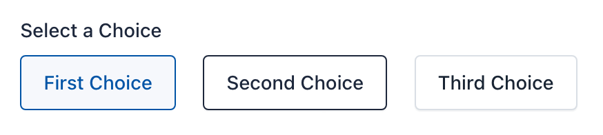
- Radio Button 
Radio Button is a component that lets you add a group of radio buttons to the form. This component gives users a list of choices, but they must select only one of them. For example: What is your favorite color?
To add, edit and delete options, you must click on the component. Then a form appears with the "Radio" field. Note that each line of this field represents a different option. And each line can be composed of three parts, separated by a vertical bar or pipe line. The format should be as follows: Label|Value|select. The second and third part of this format is optional.
For example, if you enter in the field "Radio" of the pop-up Form:
One|1
Two|2|selected
Three|3
Four|4
Five|5
The Form Preview will show 5 check boxes with the words One, Two, Three, Four and Five. The "Two" option will be selected. And if the user submits the form without making any changes, it will be sending the value: 2.
Also, since version 1.3 you can add pictures or icons to the radio buttons to give a more dynamic touch to your forms.
To insert a picture on a radio button label you must add the image url as the third setting parameter of the radio button. For example, if we set up our component as:
One
Two|2
Three|3|selected
Four|4|http://example.com/image-4.jpg
Five|5|http://example.com/image-5.jpg|selected
We'll be creating five radio buttons:
One: Creates a radio button with the value: 'One' and the label: 'One'Two|2: Creates a radio button with the value: '2' and the label: 'Two'Three|3|selected: Creates a radio button with the value: '3', the label: 'Three' and will be selected by default.Four|4|http://example.com/image-4.jpg: Creates a radio button with the value: '4', the label: 'Four' and the image will appear next to the radio button.Five|5|http://example.com/image-5.jpg|selected: Creates a radio button with the value: '5', the label: 'Five' and the image will appear next to the radio button and will be selected by default.
To add icons instead of images, you should only replace the images URLs by the icons' CSS classes. For example: glyphicon glyphicon-user, will display the user icon. Keep in mind that by default, the application has the Glyphicons Pro set of icons; however, you can use other icons like Font Awesome or DevIcons. For this, you just have to add the fonts to the CSS theme of your form.
Important: To add an image or icon to the radio button setup, you must have the first two parameters, even if they are the same.
Note: Remember that you can display your radio button horizontally by activating the 'inline' attribute.
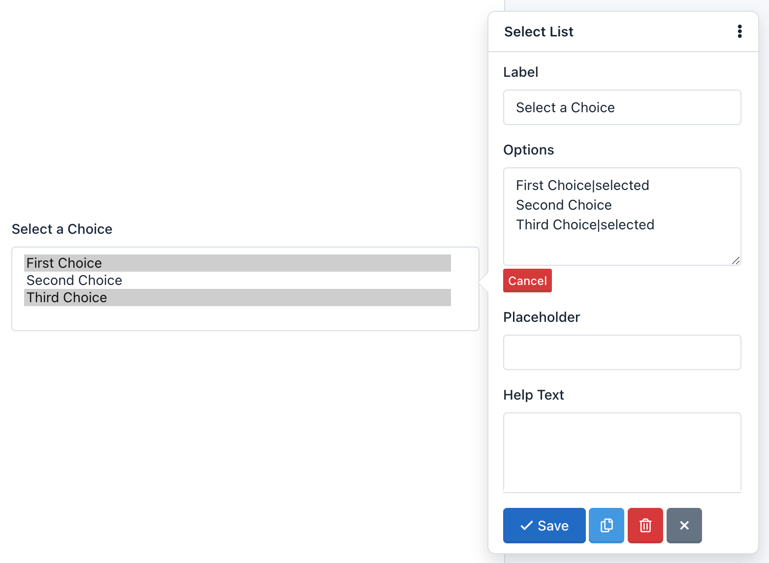
- Select List 
A Select List is a drop-down menu that allows the user to select one or several options, depending on the configuration you choose. The main difference with the Radio Button component is that you can add a lot of options without changing its size. So its use is recommended when there are plenty of options for example: Select your country of origin?
To add, edit and delete options, you must click on the component. Then a form appears with the "Options" field. Note that each line of this field represents a different option. And each line can be composed of three parts, separated by a vertical bar or pipe line. The format should be as follows: Label|Value|selected. The second and third part of this format is optional.
For example, add the following "Options":
One|1
Two|2|selected
Three|3
Four|4
Five|5
The Form Preview will show a box with the text "Two" and if the user submits the form without making any changes, it will send the value of 2.
Select List with option groups 
To create an option group <optgroup>, enclose the text with double square brackets, for example:
[[Swedish Cars]]
Volvo
Saab
[[German Cars]]
Mercedes
Audi
- Hidden Field 
By adding a hidden field to the form, this will not be shown on the form. However, hidden fields are useful for mathematical calculations or send default values without changing the form interface.
Note: You can add a label to a hidden field to work in a more comfortable way in the Form administration, for example to create conditional rules using this field.
- File Upload 
The File Upload field is a component that enables users to attach files in the form submission. Once sent, the files will appear in the detailed submission information. There are two details that must take into account:
- Allowed file types: You can limit the types of files that can be uploaded in each file field. By default, allowed file types for picture are: '.gif, .jpg, .png'. To modify the allowed file type, you must click on the component and on the 'Accept' form field that appears, change file extensions allowed, eg, '.doc, .pdf, .txt' to accept text files.
- Size limitations: You can limit the file size as define a minimum or maximum size for each field. To modify the allowed file size, click the component and then expand the pop-up form by clicking on the 'More' link. Then locate the Minimum and Maximum Size fields and enter the digit that represents the number of bytes allowed. For example, Max Size: 10311680 (resulting from the multiplication of 1024 x 1024 x 5 = 5MB).
- Snippet 
The HTML Snippet field is an advanced use component that allows you to add HTML code to your forms. It will display a Wysiwyg editor able to recognize keyboard shortcuts to style your HTML code quickly.
Be careful of entering a valid HTML code, otherwise, the Form Builder won't save the form and, it will display an error message indicating the line of code where the error was made. For example, a common mistake is to add more of one HTML element with the same ID.
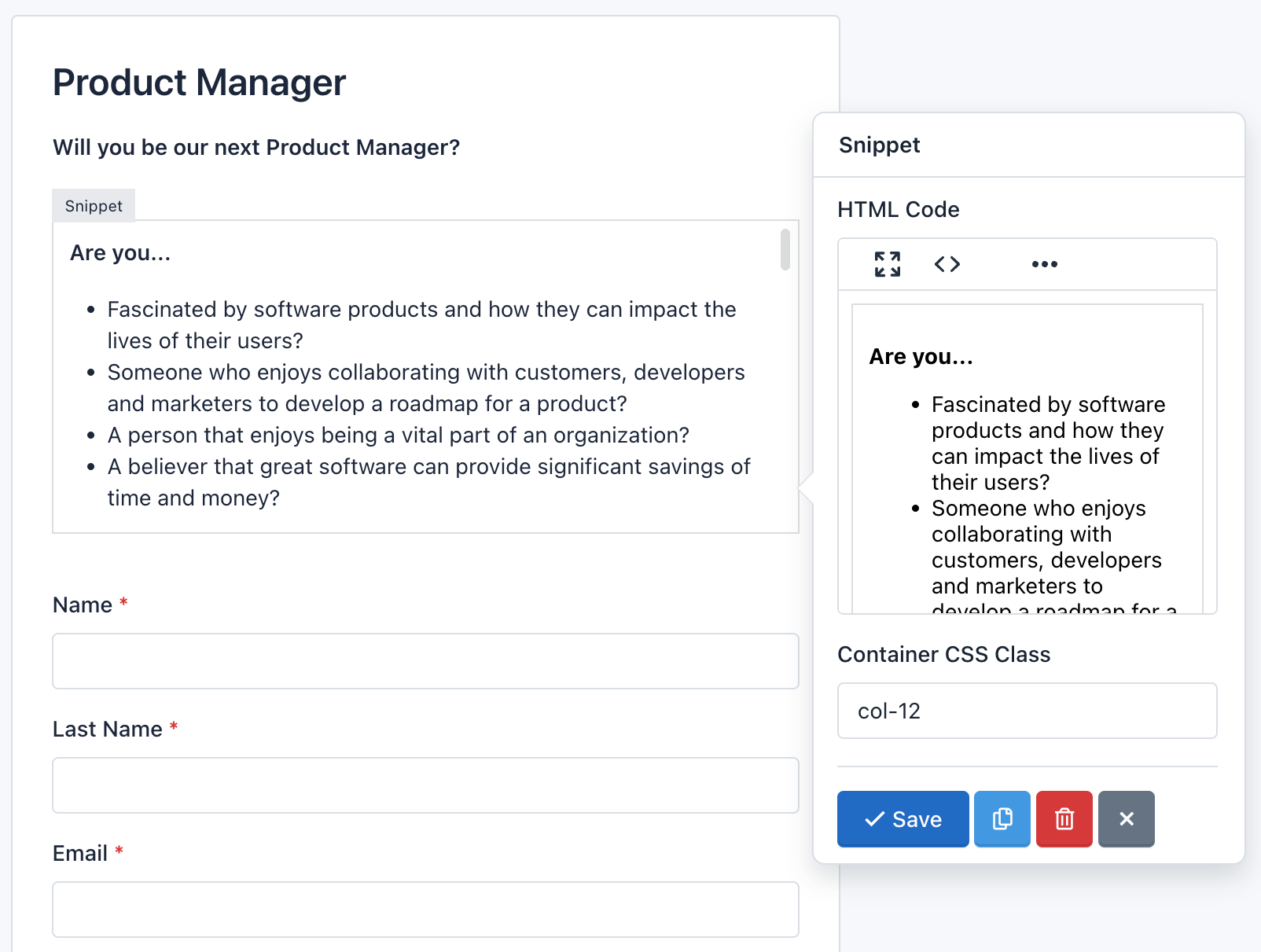
To add an HTML table, enter a link or display an image, first, you will need to click the Fullscreen button. This will open the Wysiwyg editor over the Form Builder, so you will get more space to enter all the needed content. Also, you can click the Code button to display the content as HTML code.
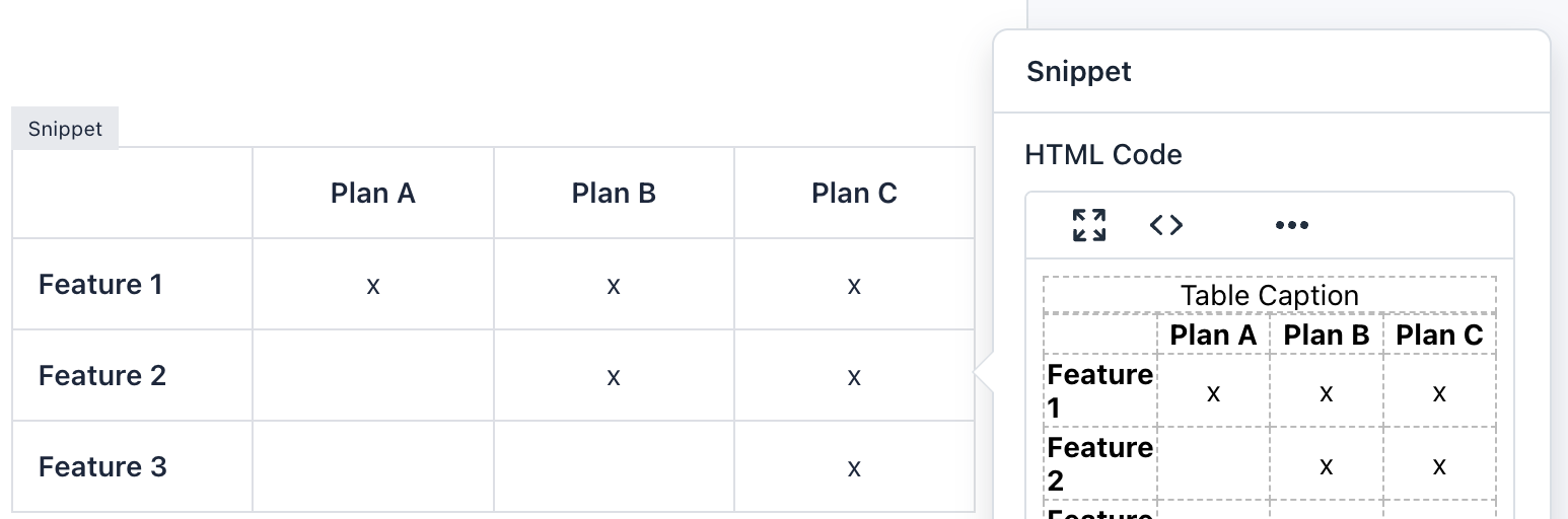
Note: Although you can add CSS and JavaScript code in a form. It is not recommended to do so, in these cases you can create a CSS Theme and/or Load external javascript file. Remember that the form you created is also displayed in the Submission Manager and its code could be incompatible.
- reCaptcha 
The reCaptcha field is an advanced component that allows you to use Google technology to verify that users are not bots and/or spammers. You can modify the reCAPTCHA configuration, like changing the theme color, type of captcha and size. A detail to keep in mind is that you can only add a reCaptcha component per Form.
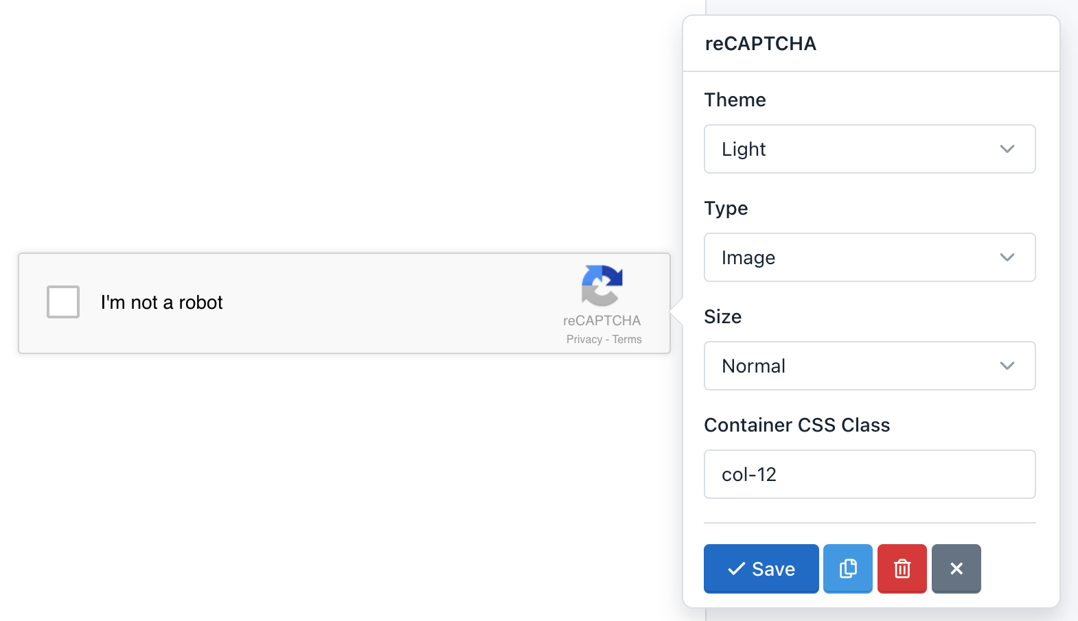
Important! Before adding the reCAPTCHA component to your Form, you must first add reCAPTCHA keys in the site configuration. Otherwise, reCAPTCHA will not operate. If you created the form before adding the keys, you must update the form.
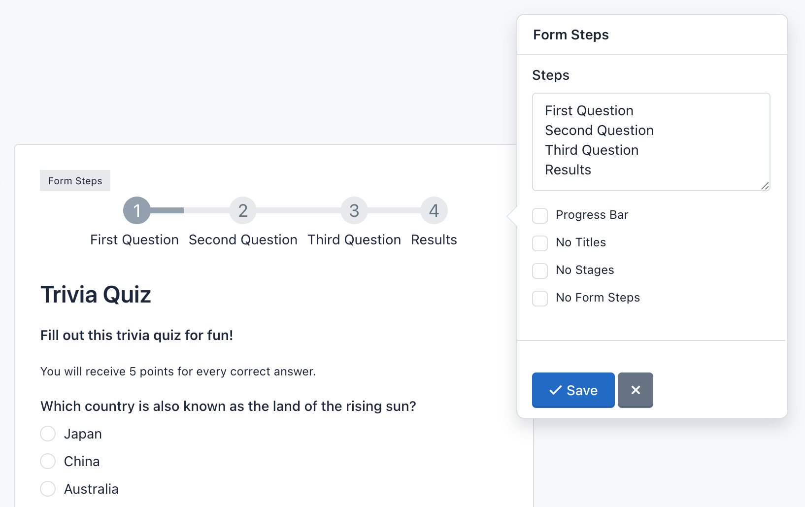
- Page Break 
The Page break field is an advanced component that allows you to create multi-step or multi-page forms. For each page break created you will add a new page. In addition, a header will be displayed above the form to let users know in which step they are and how many steps must follow to submit the form. There are two details that must take into account:
- The Page Break component adds two buttons to allow Form Navigation. You can customize the text on the button 'Next' or 'Previous' by clicking on the component.
- Form Steps: Appear above the form. Settings:
- Click Form Steps to check its settings. You can change the titles of each step in the field Form Steps. Each line matches a title.
- You can specify to display only the titles or steps (numbers).
- You can change the step numbers by glyphicons icons. To use Glyphicons in stages, you should add to each line of the Steps fields, a vertical bar or pipe line followed by 'icon-[name of icon]'. For example, if I want to replace the number 1, I write it in the first line of Steps: 'Untitled Step|icon-user'. Go to Glyphicons to view the name of the icons you can use.
- You can change the design of the steps for a progress bar indicating the percentage that has been achieved.
- Finally, you can hide the Form Steps by checking the 'No Form Steps' option.
Note: You can go to a specific page by appending the page number to the URL, for example to go to the second page add the "p=2" query string.
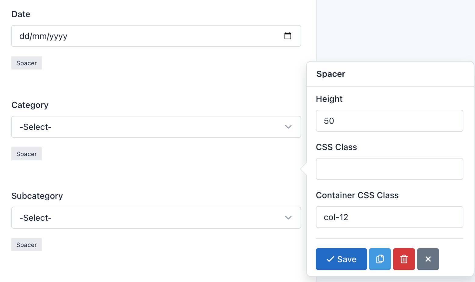
- Spacer 
The Spacer component allows you to add precise vertical spacing between fields on your forms. Just drag and drop a Spacer between your fields and set the number of pixels between they.
Options:
- Height: Is the space defined by the number of pixels.
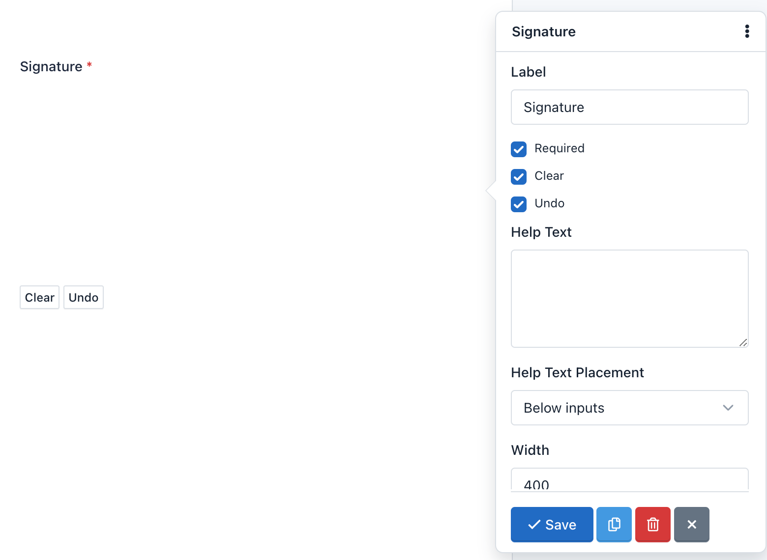
- Signature 
The Signature component allow your end users to sign your form – either with their mouse or finger on an iPad/smartphone – their John Hancock directly onto the form. So, you can securely capture signatures for contracts, legal documents, and other forms in which you need a physical autograph.
There are two details that must take into account:
- The Signature component adds two buttons to allow Canvas Interactions. You can customize the text on the 'Clean' and 'Undo' buttons by clicking on the component.
- Field Settings: The Signature field has the following special options:
- Clear: Enable / Disable the "Clear" button. When an end user clicks the "Clear" button, the signature will be removed. And the canvas will be clean to start again.
- Undo: Enable / Disable the "Undo" button. When an end user clicks the "Undo" button, the last stroke of his signature will be removed. He can continue pressing this button to undo his signature step by step.
- Additionally, you can define the width and height of the canvas, the color of the pencil, as well as change the text of the buttons between other common settings.
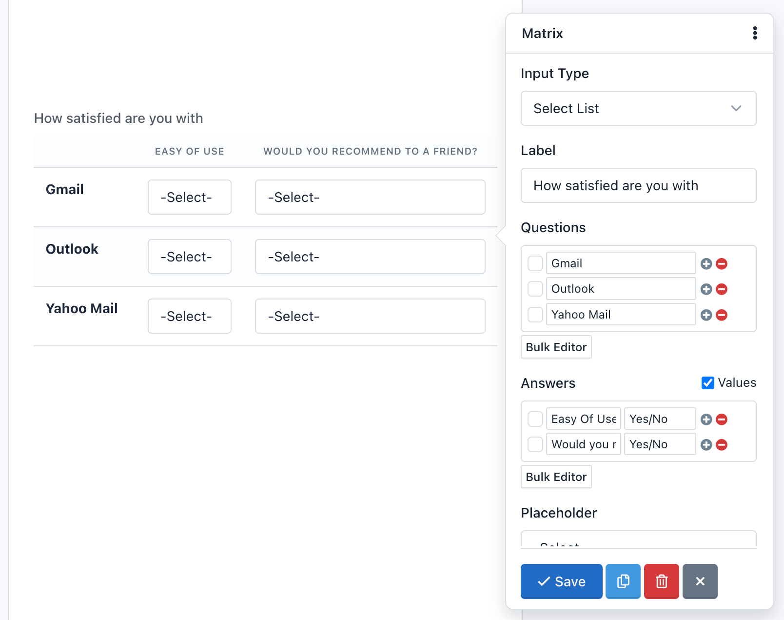
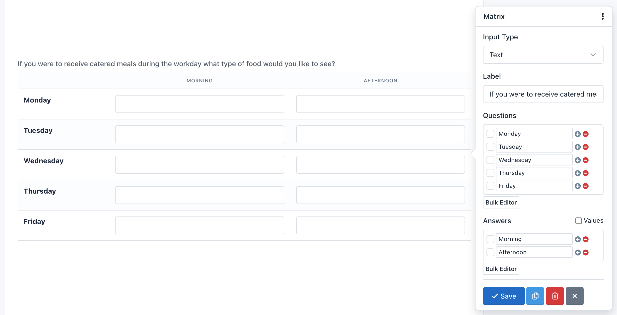
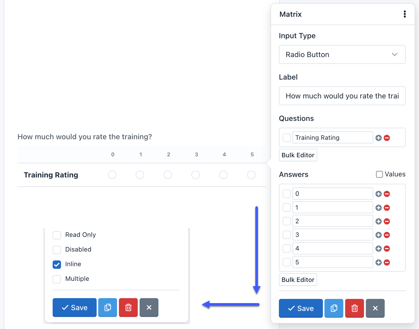
- Matrix Field 
The Matrix field is an advanced component, allows you to group multiple form controls with the same input type within a table. You can create a matrix field with the following input types:
- Radio Button (By Default)
- Checkbox
- Select List
- Text
- Text Area
- Number
- Range (Slider)
- Tel (Phone)
- URL
- Color
- Password
- Date
- DateTime-Local
- Time
- Month
- Week
All the form controls are fully customizable and according to its type, the correct input validation will be applied.
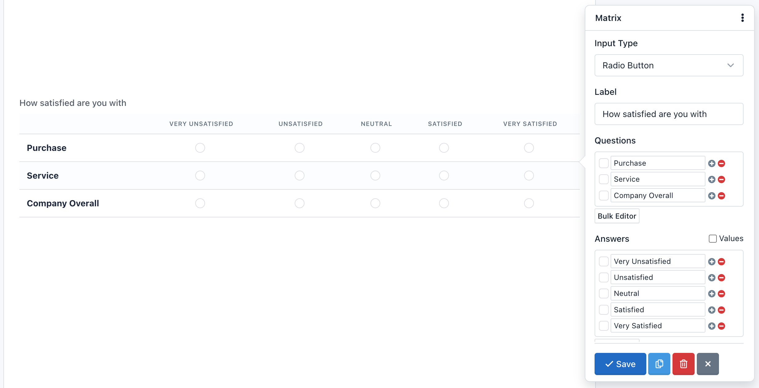
A Matrix field can have any number of questions (rows) and answers (columns), then you can set different values to each answer.
A special input type for the Matrix is Select List, because you need to add different values (options), to do this just check "Values" and in each "Value" field enter slash separated values ("/"). If you want to enable a default empty option, you need to use the Placeholder setting.
You are able to make open questions too, with the Text Input variation, each row contains a set of text entry boxes. This variation looks and acts similar to the Text Field. The same applies for other input fields based on text, like a text area or number fields.
A special feature in the Matrix field is the ability to hide the questions. Just check the "Inline" option and questions will disappear. You can use this feature if you only want to do a single question in a tabular format.
Note: When a table is very big, we will need to add the "table-responsive" class within the "Container CSS Class" setting.
- Net Promoter Score (NPS) 
NPS is probably the most important customer satisfaction and customer loyalty metric to track and now it’s available in Easy Forms.
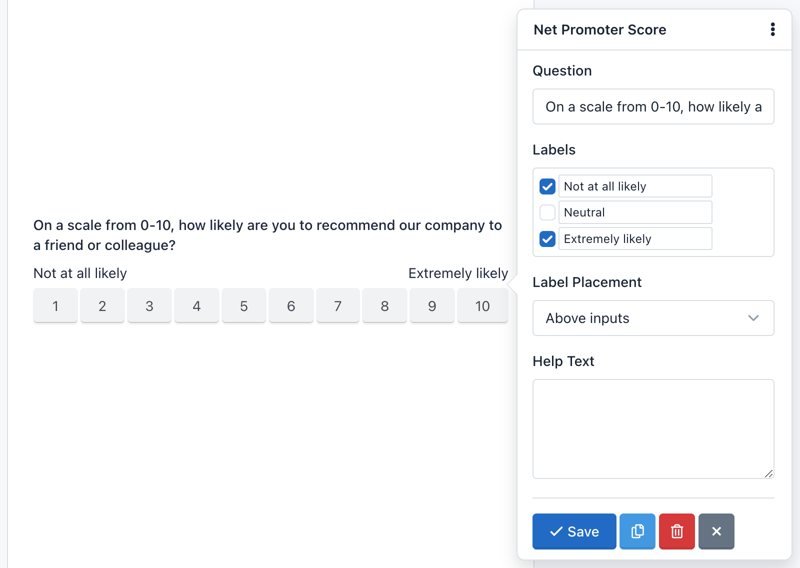
Easy Forms NPS helps you collect authentic customer feedback, so you really understand how your organization is performing. It's a way of recording what your customers think, their satisfaction levels, and whether they'd recommend you.
Ask them things like:
“On a scale of 1–10, how likely are you to recommend us to your friends?”
This gives you qualitative insight into 'why' your customers feel that way, which tends to work better than those generic annual customer satisfaction surveys.
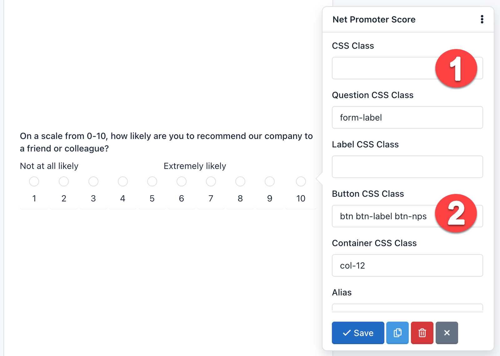
This component allows you to customize the question, show labels, help text and more. Also, it can be displayed as buttons or as radio buttons. By default, the design shows buttons. Just remove the CSS Class: hidden and replace the Button Css Class with: btn btn-label btn-nps.
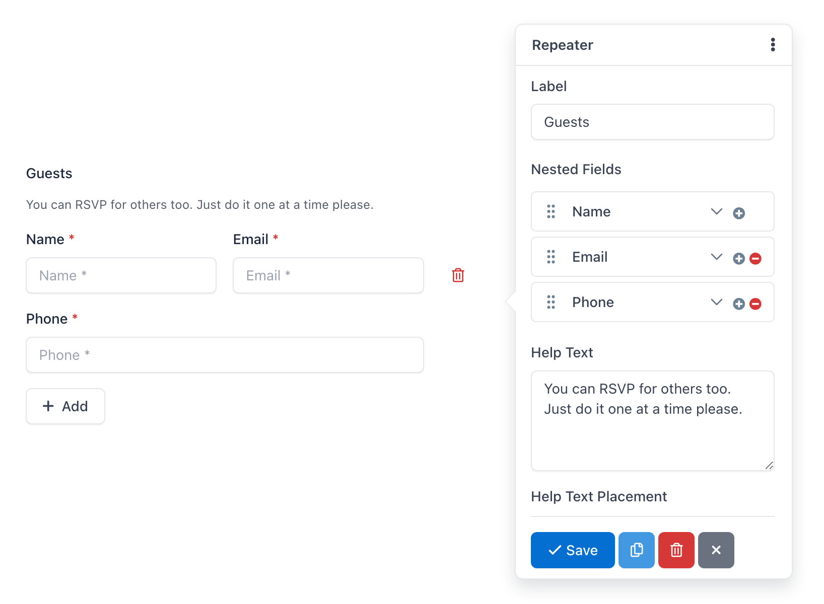
- Repeater Field 
The Repeater field within the form builder is a powerful component that allows you to dynamically add multiple sets of nested fields (sub-fields). Essentially, it lets you create a "template" of fields (e.g., a text field, an email field or a date field) and then allows the form filler to "repeat" that entire group as many times as needed.
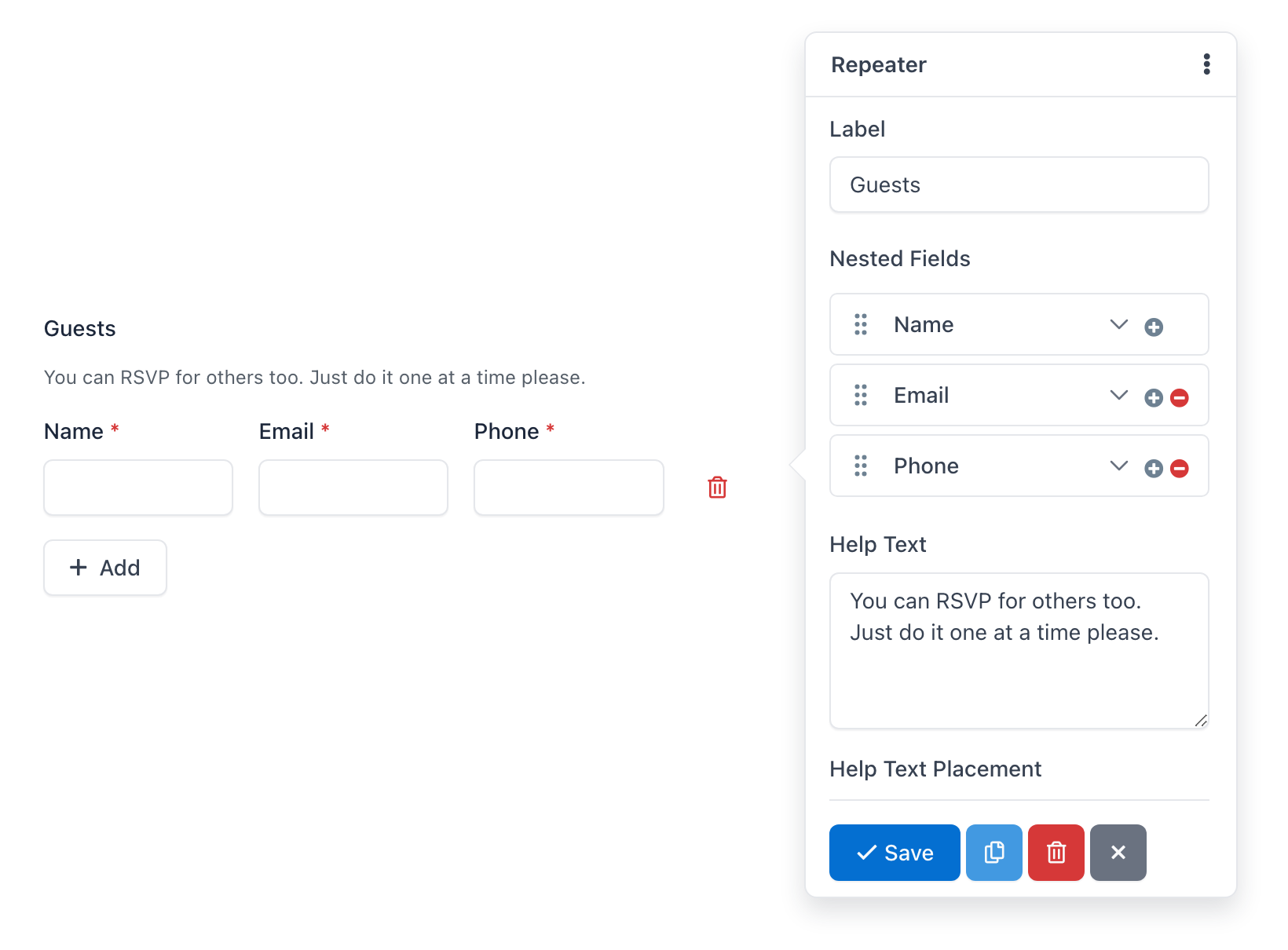
The Repeater component is highly configurable, allowing you to control not just the repeated fields themselves, but also the overall behavior and appearance of the repeatable section.
General Field Settings
- Label: The main title displayed for the entire repeater section (e.g., "Guests," "Members").
- Help Text: Additional information or instructions to guide the user on how to use the repeater.
- CSS Classes: Custom CSS classes for styling the repeater field container to match your website's design.
- Min: Whether the form starts with one or more empty repeated rows by default. It's the minimum number of repeated sections a user must add (e.g., "at least one guest").
- Max: The maximum number of repeated sections a user can add (e.g., "up to 5 skills"). Leaving this empty means 1 repeats.
- "Add Button" Text: The text displayed on the button that adds a new repeated section (e.g., "Add Another Guest," "Add More").
- "Remove Button" Text: The text displayed on the button that removes a repeated section (e.g., "Remove," "Delete").
- Button Css Classes: The options for the appearance of the "Add" and "Remove" buttons.
Nested Fields (Sub-fields) within the Repeater
This is where the core of the repeater's power lies.
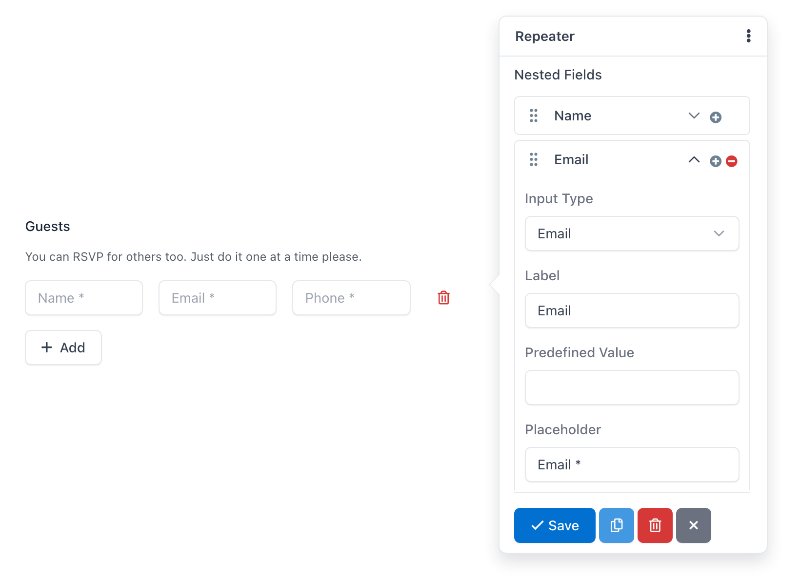
You can add almost any standard form field type into the repeater, and then configure each of them individually:
- Text Input: For single-line text (e.g., "Name," "City").
- Text Area: For multi-line text (e.g., "Description," "Comments").
- Number Field: For numerical input (e.g., "Age," "Quantity").
- Email Field: For email addresses.
- Phone Number Field: For phone numbers.
- Date Picker: For selecting dates (e.g., "Start Date," "End Date").
- Time Picker: For selecting times.
- Dropdown/Select: For single-choice options from a predefined list.
- Radio Buttons: For single-choice options with visual buttons.
- Checkboxes: For multiple-choice options.
- URL Field: For website addresses.
- Hidden Field: For private and hidden values.
For each of these nested fields, you can typically configure:
- Label: The label for the individual field (e.g., "Guest Name").
- Placeholder: Hint text displayed within the input field.
- Predefined Value: A pre-filled value.
- Required: Whether the field must be filled out before submission.
- Unique: To verify if the information entered into this field has not been submitted previously
- CSS Classes: For each nested field styling.
- Button 
The button field is a component that allows you to send the forms. While it is normal to add one button per form, nothing prevents you to add more, for example at the beginning and end of the form. This component can be of 3 types:
- Submit: To submit the form. It is selected by default.
- Reset: To reset the form to their default values.
- Image: Displays an image on the button and like Submit is used to submit the form. If you use this type of button you need to add the URL of the image and also remove the CSS class.
- Button: This type doesn't send the form, but it can be used to interact with the fields via javascript.
You can add an icon to the buttons type 'Submit', 'Reset' and 'Button', writing in the attribute 'Button Text' the icon label. For example:
<span class="glyphicon glyphicon-shopping-cart"></span> Buy Now!
It will display your button with a nice icon at the beginning:
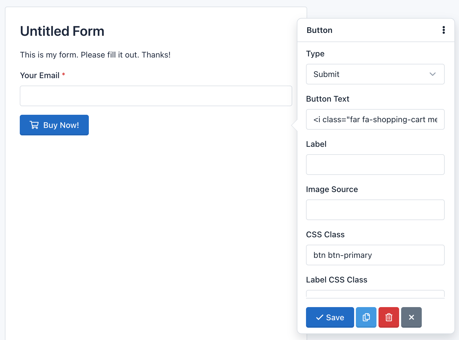
Note: The CSS class: 'btn btn-primary' add the default design to the button. Go to Bootstrap CSS for more information.
Field Validation 
A very important point to consider is the field validation that runs when users submit a form.
Field validation is the process by which it is verified that the data submitted by users meet certain requirements. For example, a Date Field requires that the value sent to the server has the following format yyyy-mm-dd. Validation ensures that this happens.
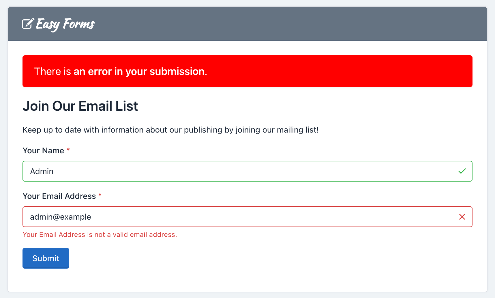
You should note that Easy Forms works with standard HTML5 fields, so you can always go to HTML5 documentation for more information. In addition to validation by type, fields may have other requirements, such as 'Required' and 'Unique'.
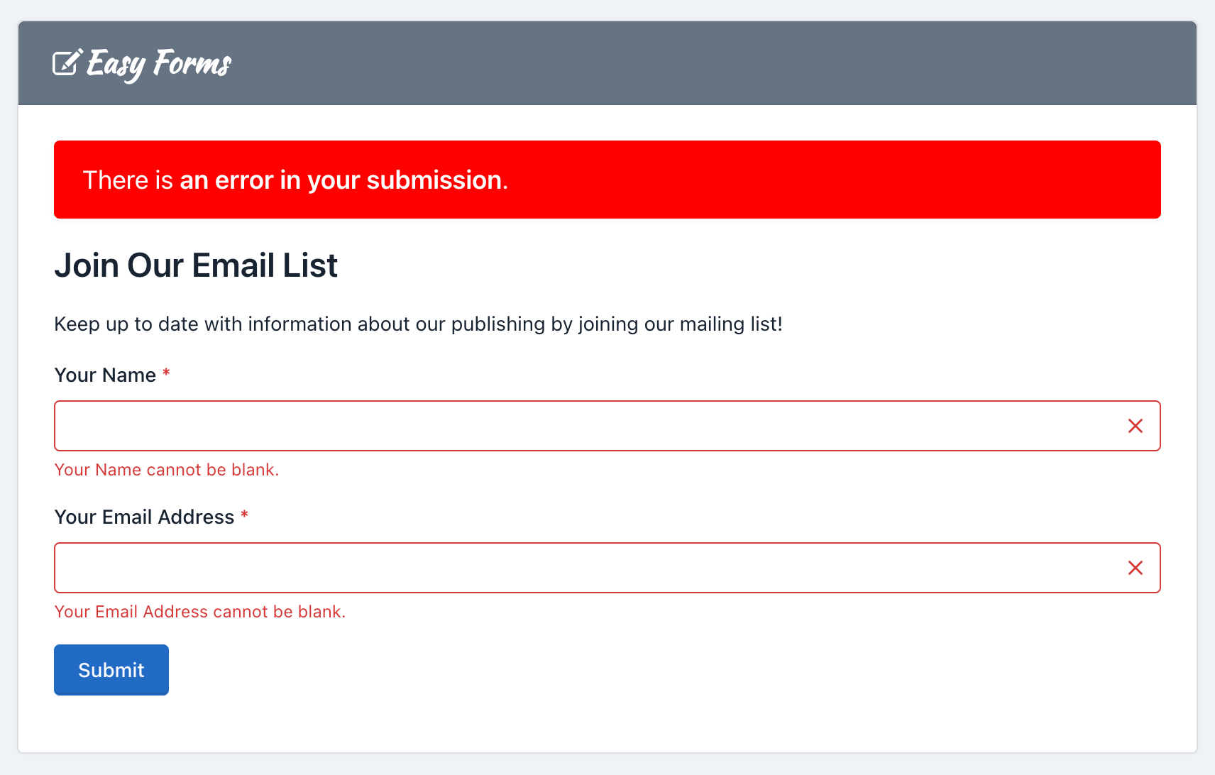
Many of these requirements are validated at the client, by the browser; but they are all validated on the server, by Easy Forms.